UVU Office of Teaching and Learning
Overview
- Role: Designer
- Duration: 4 months
- Platform: Website
The OTL (Office of Teaching and Learning) for UVU is a website that is primarily for faculty but also for students to aid them with many resources. The project was first assigned to my group at the beginning of the semester in August and it has taken the rest of the semester to complete. This was a team environment with each of us being tasked with individual pages. The problem is that UVU Faculty, Staff, and Students need help finding information on the OTL website due to disorganization. My goal for this website redesign was to reorganize and condense the content throughout the website to make a smoother experience for our audience.
What I did:
We were first introduced to the site and got a feel of how it is used. After we spoke with Jena Giddings, project manager for the OTL. We discussed what they wanted for the site and what was essential for their department.
Data
After our interview, we began going through the current site and doing a website content audit gathering data. Then once we gathered all of the content we began our surveying. We created a survey that targeted our audience. After gathering all of our data we started our restructuring process.
Site Map
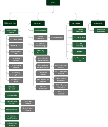
Our next step was to create a site map of the OTL so we could understand the hierarchy and flow better to create a simple experience for our users.
Wireframes
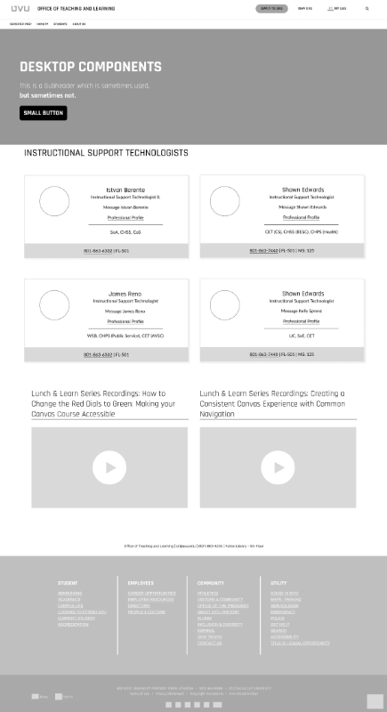
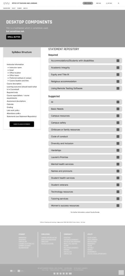
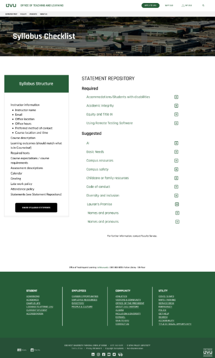
With each page, we were all assigned certain pages. I created the pages by cutting some info. Waiting on feedback from peers and instructors I redid them for the surface comps.
Surface Comps
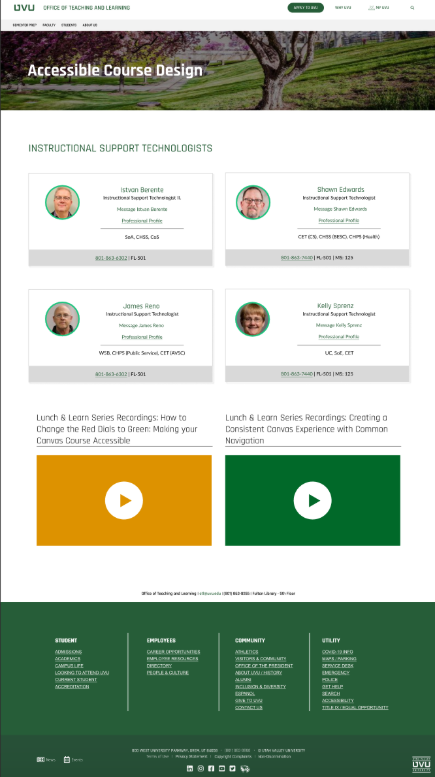
For the surface comps, I stayed with the UVU style guide. Most of my feedback was adjusting margins and thinking more about the content. I made adjustments and mostly cut down on irrelevant content. The site before was a bunch of content all over the place so we wanted to cut content that seemed redundant or irrelevant.
Prototype Usability Testing
Finally, we did some testing on our prototype to see our audience interact with our site to see if there are any more final improvements we could make. The main result we found in each of the 7 tests we conducted was that they didn't understand why the Semester Prep tab on the navigation bar was there. They thought the Semester Prep page should just be under the Faculty. Overall the results we found were extremely helpful.
Resolution:
We formally delivered the concluding project brief for the semester to the stakeholders. While no selection was made, the experience proved valuable, mirroring a real-world design process within the industry. It facilitated a meaningful connection with our audience and provided insights into the intricacies of client interaction and management. In summary, this project served as a platform for refining and enhancing my skill set.