EDitor's ASsistant Redesign
Overview
- Role: Designer
- Duration: 1 Month
- Platform: Desktop Website
This was a project that was assigned to me during the semester. This website is primarily for professors wanting to submit papers and go to conferences with or without students to attend or even present at. I first took a look at the original site going through the process of navigating the site. I found that the problem was that there was just too much content not properly organized and because of that users find it difficult to use it.
What I did:
Research
I was not able to find many examples of websites like this one to gain some more information, instead I decided to ask my professor some questions about the site as well. He let me know as he was going through the site himself that he agreed with me on it being a mess of content and visually it made it even harder. My goal was to make processes simple with fewer clicks and also to make the site visually appealing.
Sketches
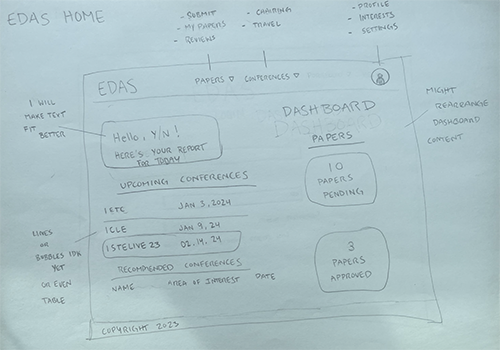
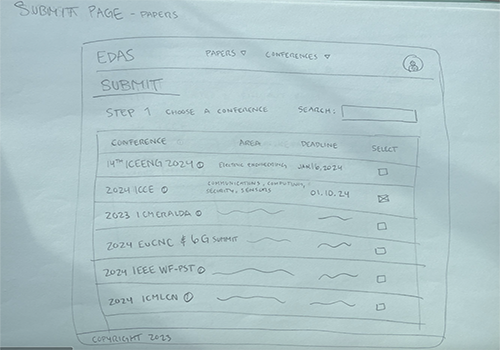
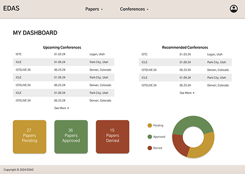
With the research I gathered I decided to not cut content because it was all important but to focus on organizing content. Its previous nav bar had every page on it, and that was too much so I just organized it by papers and conferences and I took the dropdown approach. I found that it would make the site easier to use. I also wanted to touch up the landing page and add a dashboard since this site had a bunch of data and tables I wanted to incorporate it on the landing dashboard to simplify the process even more.
Wireframes
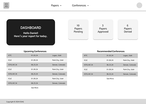
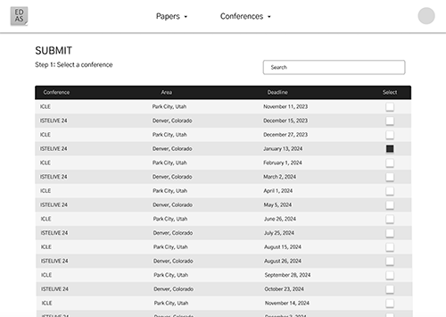
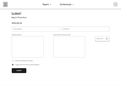
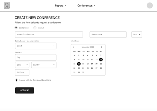
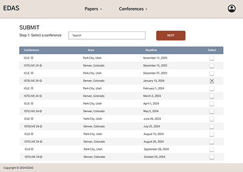
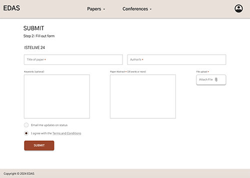
I stuck with my sketches and organized the nav bar as I had it. Then I constructed the dashboard exploring many different layouts. I got a lot of feedback on how helpful the idea of the dashboard would be but to simply cut the introduction box saying hello and to experiment with the layout. For the other pages, I stuck with the same content just making it simpler to look at and sort. For example, the fill-out form for submitting a paper had too much content that was already said before they got to the form and also was in their paper. All that was needed was the name, author(s), paper abstract, and upload file button. Nothing else would be needed.
Surface Comps
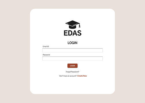
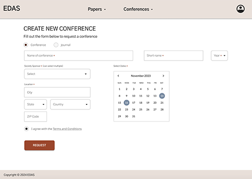
With the feedback and relocating of elements around. I made improvements with the logo since I didnt see how the sticky note connected well with what the site was really about. Since I had a lot of content taken care of, I was left to select a color scheme. The color scheme was important to me because of how horrible the color scheme was originally. I wanted to keep everything neutral since this was a professional site and adding color where I saw it would be needed to identify hierarchy.
Resolution:
From this project, I learned the importance of simplifying complex content and organizing information effectively for user-friendly navigation. Through research, sketching, wireframing, and iterating on surface compositions, I focused on streamlining processes with fewer clicks and enhancing visual appeal, ultimately creating a more efficient and aesthetically pleasing website for professors to submit papers and participate in conferences.