Feit Electric App Redesign
Overview
- Role: Designer
- Duration: 1 Month
- Platform: Moblie App
During the course of the semester, I embarked on a project that tasked me with revamping an existing application. Specifically, the focus was on a smart home device control platform. Upon analysis, it became evident that the current iteration of the app suffered from outdated design and excessive user interaction, leading to frustration. Our mission was clear: to rejuvenate the interface, streamlining user experience by minimizing unnecessary clicks and embracing modern design principles.
What I did:
Research
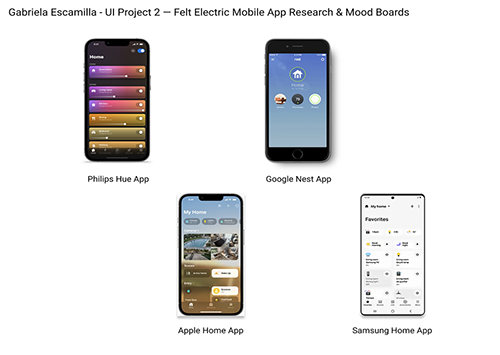
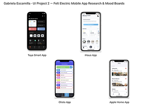
Intrigued by the concept of remote-controlled applications, I embarked on a journey to immerse myself in their realm. This quest led me through a thorough exploration of various exemplars, including the Tuya Smart app and the Apple Home app, among others. Delving deep into their interfaces and operational dynamics, I aimed to glean insights into their nuances. Armed with this knowledge, I meticulously curated a mood board comprising eight analogous applications, each offering a unique perspective on design and functionality. Ultimately, it was the Tuya app that captured my imagination, particularly its innovative use of widgets on the landing page, which offered invaluable shortcuts and inspired my vision for the project.
Sketches
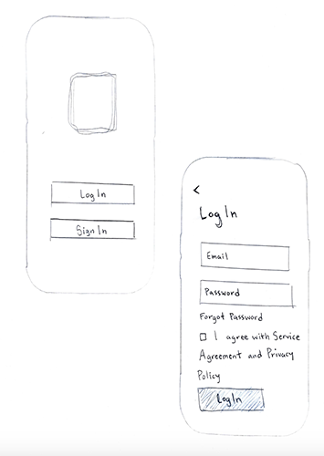
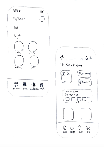
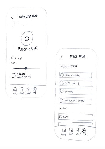
Armed with the insights gleaned from my research, I eagerly delved into the realm of design, sketching out a myriad of layouts that caught my eye. My foremost objective was to strike the delicate balance between reducing user clicks and avoiding cluttered screens teeming with excess content. Every stroke of my pencil was guided by a commitment to crafting an interface that seamlessly merged efficiency with elegance.
Wireframes
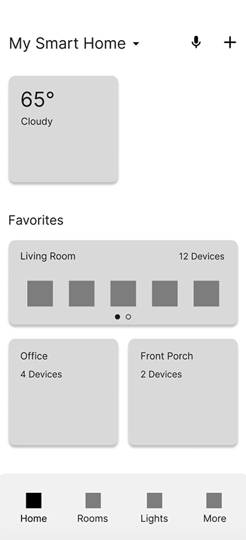
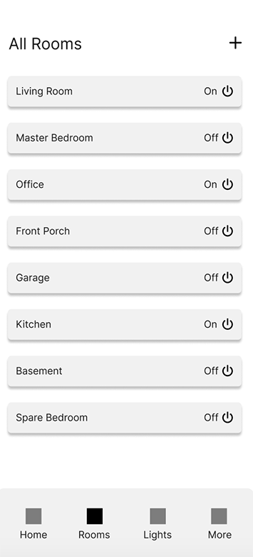
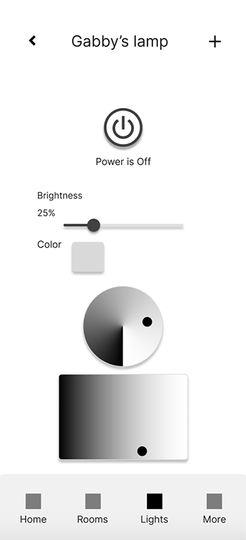
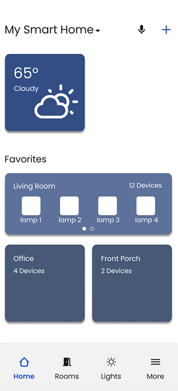
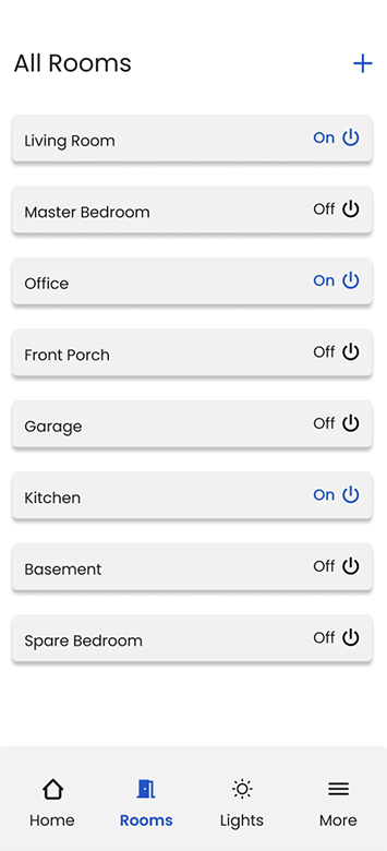
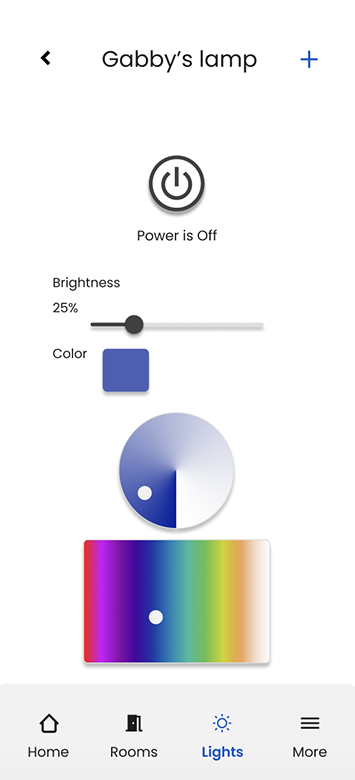
Following extensive experimentation with diverse layouts, I opted for a widget-based design approach for the landing page, drawn to its intuitive functionality and aesthetic appeal. Transitioning to the development of the Rooms and Lights pages, I embraced simplicity as my guiding principle. Each element was meticulously arranged, with names positioned on the left and corresponding on/off toggles aligned neatly to the right within each row. Upon interaction with individual lights, users were greeted with a succinct array of options, including toggling power, adjusting brightness, and selecting colors, ensuring a seamless and immersive user experience.
Surface Comps
With the wireframes finalized, my attention turned towards crafting the perfect color palette to complement the interface. Seeking a visual aesthetic that would evoke a sense of calm and clarity, I gravitated towards a palette dominated by soothing muted blues. This choice not only ensured an eye-catching design but also prioritized user comfort and ease of navigation, fostering a harmonious interaction between form and function.
Resolution:
This project served as a profound lesson in the intricate art of app construction. As I delved into its depths, I encountered the diverse structures and rationales underpinning each unique application. The challenge lay in deciphering these nuances and harnessing them to shape a coherent and intuitive user experience. Reflecting on this journey, I find myself drawn to the myriad possibilities that lie beyond its scope. In hindsight, I envision incorporating elements such as scene creation and timers, enriching the app's functionality and depth. Though constrained by the constraints of time, this realization ignites a spark of ambition, propelling me towards future endeavors where creativity knows no bounds.